Having fun with SVG text
February 21, 2024Last weekend, I redesigned my blog. As part of this redesign, I wanted to make something fun for my front page. I started sketching a bit on paper, got an idea, and soon I was doing a search for "css curved text".
The first result I found was the Curved Text Along a Path tutorial by Geoff Graham on CSS Tricks. It demonstrates how to add curved text to a web page using an inline SVG.
It was perfect.
About half an hour of experimenting and browsing the MDN Web Docs later, I was looking at the end result. It's the most beautiful thing I've made in years.

Now, unless you have an above-average interest in HTML, CSS and vector graphics, you may want to tap out of this page now, because the rest of this will be me nerding out over how the sausage is made.
...
Still here?
Good! Let's jump in.
Where we're going, we don't need Photoshop
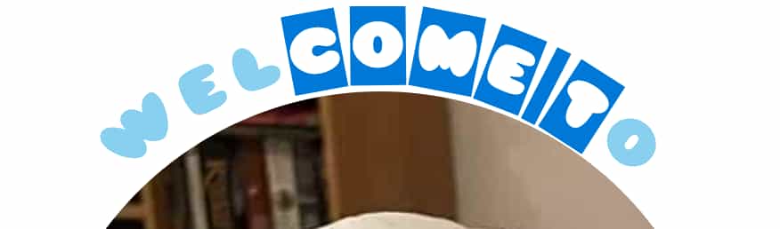
<header>
<svg viewBox="0 0 500 500" xmlns="http://www.w3.org/2000/svg">
<title>Welcome to my website</title>
<path id="top-curve" d="M 100 100 C 100 90, 250 -40, 400 100" stroke="transparent" fill="transparent"/>
<path id="bottom-curve" d="M 100 400 C 100 410, 250 540, 400 400" stroke="transparent" fill="transparent"/>
<text aria-hidden="true" textLength="340">
<textPath xlink:href="#top-curve">Welcome to</textPath>
</text>
<text aria-hidden="true" textLength="340">
<textPath xlink:href="#bottom-curve" dominant-baseline="hanging">my website</textPath>
</text>
</svg>
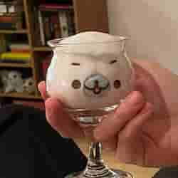
<img src="/img/logo-500px.jpg" alt="A seal in a wine glass">
</header>
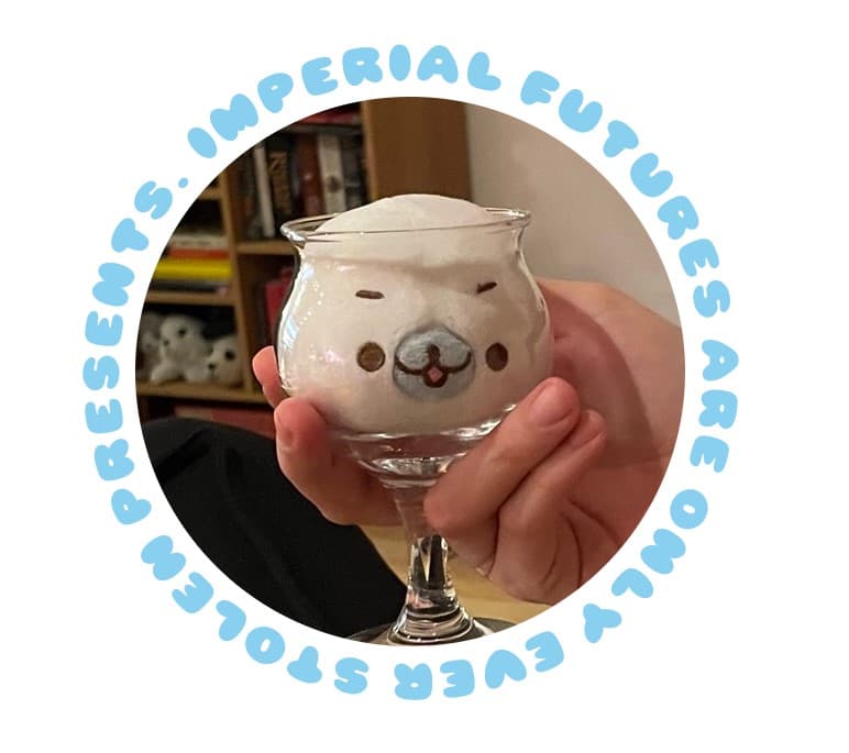
This is the complete HTML for the front page header image and text. It is made up of two main elements:
- The
<img>element, which draws the circular photo in the middle. - The
<svg>element, which draws the text around it.
A side note on screen readers
The word "draw" can be a bit misleading here, because it may lead you to believe the text is purely graphical.
Yes - the SVG text functions pretty much like regular text! You can select it, copy it, and screen readers will even read it!
That last point is a problem. When testing how the SVG reads with the built-in screen reader on Windows 11, it was... bad. It just does not read well. It may be that other screen readers handle SVG text better, but I do not want to rely on it.
To improve on this, I went with the most robust-looking solution I could find: I added a <title> element with equivalent text to the SVG, and hid the text elements from screen readers with aria-hidden="true". This made the reading experience significantly more pleasant.
(If you know of better, more accessible ways to do this, please contact me so I can update this post.)
Styling
To reliably wrap the text around the photo, I needed some reliable styling, and I needed that styling to be responsive across different screen sizes.
I solved this using a CSS grid where:
- The
<img>and<svg>elements are always perfectly square. - They are always the same size.
- They shrink on smaller screens.
- They are placed directly on top of each other.
.home-page header {
    display: grid;
    margin: 40px 0px;
    max-width: 500px; /* Will shrink, but keep height proportional if the screen is narrow */
}

.home-page header * {
    /* Place all child elements in the same, single cell of the grid */
    grid-column: 1;
    grid-row: 1;
    /* Ensure identical height and width */
    height: 100%;
    width: 100%;
}

.home-page header img {
    z-index: 1;
    border-radius: 100%; /* Makes the image circular */
    padding: 10%; /* Clears space for text around the image */
}

.home-page header svg {
    z-index: 2;
}
The image is made square by, well, being a square image. The SVG is made square by the viewBox="0 0 500 500" property, which defines the internal dimensions of the SVG - the draw positions range from (0,0) to (500,500).
And while we're in CSS world - the actual SVG text is also styled using CSS!
.home-page header svg text {
    fill: #89cff0;
    font-family: babycakes; /* Balloon font! https://www.fontspace.com/babycakes-font-f20531 */
    font-size: 36px;
    text-transform: uppercase;
}
Text, paths, and text paths
Let's look at the contents of the <svg> again, and remove <title> and aria-hidden for brevity.
<path id="top-curve" d="M 100 100 C 100 90, 250 -40, 400 100" stroke="transparent" fill="transparent"/>
<path id="bottom-curve" d="M 100 400 C 100 410, 250 540, 400 400" stroke="transparent" fill="transparent"/>
<text textLength="340">
    <textPath xlink:href="#top-curve">Welcome to</textPath>
</text>
<text textLength="340">
    <textPath xlink:href="#bottom-curve" dominant-baseline="hanging">my website</textPath>
</text>
The <text> elements draw text. The textLength attributes say how many pixels long the text should be, and squishes or stretches the text to make it so. I gave both the top and bottom text elements textLength="340" so they would stretch evenly left-to-right.
Inside them are the <textPath> elements, which draw text along a given path. The xlink:href attributes say which path they should follow. The dominant-baseline="hanging" attribute places the bottom text below the path, instead of above it.
Finally, the transparent <path> elements supply the curves, as defined by their d attribute.
Can we talk about the curves? I need to talk to you about the curves.
Bézier, you beautiful man
Okay, so I've been in the rough vicinity of graphics and animation long enough to have heard "Bézier curves" referenced a few dozen times in my life. I never took the time to look up what they were. I assumed they were complicated and slightly magical, only taught in spellbooks sourced from the Graphics Wizards' tower.
To draw my text exactly how I wanted it, I needed Bézier curves. So I had to up look how they worked, and what all of the coordinates in the code samples meant.
It turns out I was bang on the money. They are magical.
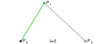
I cannot hope to give a servicable tutorial for how they work - try the Bézier curve tutorial and SVG Paths tutorial on MDN for that.
In short, they consist of some number of control points, and move from the first control point to the final control point via the fun math-y thing the animation demonstrates. Two control points makes a linear curve (a line), three makes a quadratic curve, four makes a cubic curve, and so on.
This gave me just enough to go on to make a symmetric pair of cubic curves that gently curve around the image.
<!-- Cubic curve from (100,100), via (100,90) and (250,-40), to (400,100) -->
<path id="top-curve" d="M 100 100 C 100 90, 250 -40, 400 100"/>
Now, uh. In the middle of writing this, while reading the linked SVG Paths tutorial, I realized I could have made this using a simpler quadratic curve instead.
<!-- Quadratic curve from (100,95), via (250,-25), to (400,94) -->
<path id="top-curve" d="M 100 95 Q 250 -25, 400 95"/>
And. I also realized there's a non-Bézier "arc" curve. For drawing arcs. Like around a circle.
<!-- Arc from (100,100), in a 210 px radius with sweep-flag enabled, to (400,100) -->
<path id="top-curve" d="M 100 100 A 210 210 0 0 1 400 100"/>
It turns out arcs are a little bit complicated so for this use case I'm happy keeping it a Bézier curve.
Though... throwing a couple of arcs together is a simple way to draw a full circle path... so maybe...
I've already written up everything I learned so far, so let's close on this.
<path id="curve" d="M 100 100 A 210 210 0 0 1 400 400 A 210 210 0 0 1 100 100" stroke="transparent" fill="transparent"/>
<text aria-hidden="true" textLength="1320">
    <textPath xlink:href="#curve">
        Imperial futures are only ever stolen presents.
    </textPath>
</text>